CSS
| Catégorie | Cours |
|---|
Cours de Julie Chaumard
To Do
| Chapters | Homeworks | Exercises | Weeks | Dates |
|---|---|---|---|---|
| CSS | 2 | 10/06/2025 | ||
| 2 | 10/06/2025 | |||
Book - Chapter 4 - P.493
- Connolly, R. and Hoar, R. (2018). Fundamentals of Web Development (2nd ed.). Pearson.
What is CSS ?
At various places in the previous chapter on HTML, it was mentioned that in current web development best practices HTML should not describe the formatting or presentation of documents. Instead that presentation task is best performed using Cascading Style Sheets (CSS).
CSS is a W3C standard for describing the appearance of HTML elements. Another common way to describe CSS's function is to say that CSS is used to define the presentation of HTML documents. With CSS, we can assign font properties, colors, sizes, borders, background images, and even position elements on the page.
CSS can be added directly to any HTML element (via the style attribute), within the <head> element, or, most commonly, in a separate text file that contains only CSS.
Who and when ?
CSS (Cascading Style Sheets) was invented by Håkon Wium Lie in 1994.
Details:
- In October 1994, Håkon Wium Lie, from Norway, then an employee at CERN (later at the W3C), published the first proposal for a style sheet language for the web.
- He aimed to separate HTML content from visual presentation, which was not possible with HTML alone at the time.
- The W3C (World Wide Web Consortium) adopted the first official CSS specification, called CSS1, in 1996.
Håkon Wium Lie worked with Tim Berners-Lee, the inventor of the web, and played a major role in standardizing modern web technologies.
Would you like a timeline or a pedagogical summary for your students?
Browser adoption ?
Check the compatibility of the properties for the browser your are developing.
Framework
- bootstrap
- Tailwind
- Foundation
Responsive
Add in HTML
<link rel="stylesheet" href="css/style.css">
Program architecture
Type of architecture : atomic system,…
├── /asssets
│   └── imgages
│   └── css
│       └── header.css
│       └── footer.css
│       └── main.css

sccs
	templates
		header.scss
		footer.scss
	components
		tryit.scss
		help.scss
CSS Syntax
A CSS document consists of one or more style rules. A rule consists of a selector that identifies the HTML element or elements that will be affected, followed by a series of property:value pairs (each pair is also called a declaration).
- Selector
- Property
- Value
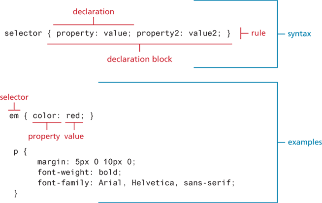
Comment
/* comment goes here */Properties
| Property Type | Properties |
|---|---|
| Fonts | font, font-family, font-size, font-style,font-weight, @font-face |
| Text | letter-spacing, line-height, text-align, text-decoration*, text-indent |
| Color and background | background, background-color, background-image, background-position, background-repeat, box-shadow, color, opacity |
| Borders | border*, border-color, border-width, border-style, border-top, border-left, border-image*, border-radius |
| Spacing | padding, padding-bottom, padding-left, margin, margin-bottom, margin-left, |
| Sizing | height, max-height, max-width, min-height, min-width, width |
| Layout | bottom, left, right, top, clear, display, float, overflow, position, visibility, z-index |
| Lists | list-style*, list-style-image, list-style-type |
| Effects | animation*, filter, perspective, transform*, transition* |
Selectors
Single selector, group selectors
/* commas allow you to group selectors */
p, div, aside {
   margin: 0;
   padding: 0;
}
/* the above single grouped selector is equivalent to the
following: */
p {
   margin: 0;
   padding: 0;
}
div {
   margin: 0;
   padding: 0;
}
aside {
   margin: 0;
   padding: 0;
}
Reset or remove browser defaults
html, body, div, span, h1, h2, h3, h4, h5, h6, p {
  margin: 0;
  padding: 0;
  border: 0;
  font-size: 100%;
  vertical-align: baseline;
}

OR

* {
    margin: 0;
    padding: 0;
    border: 0;
    font-size: 100%;
    vertical-align: baseline;
    font-weight: normal;
}
Class Selectors
Give the same style to different elements that not depend on the HTML tags.
.first {
   font-style: italic;
   color: red;
}

<body>
   <h1 class=“first”>Reviews</h1>
   <div>
      <p class=“first”>By Ricardo on <time>2016-05-23</time></p>
      <p>Easy on the HDR buddy.</p>
   </div>
   <hr/>
   <div>
      <p class=“first”>By Susan on <time>2016-11-18</time></p>
      <p>I love Central Park.</p>
   </div>
   <hr/>
</body>
Id selectors
An id is use once in the HTML, to identify specifically 1 element
#latestComment {
   font-style: italic;
   color: red;
}

<body>
   <h1>Reviews</h1>
   <div id=“latestComment”>
      <p>By Ricardo on <time>2016-05-23</time></p>
      <p>Easy on the HDR buddy.</p>
   </div>
   <hr/>
   <div>
      <p>By Susan on <time>2016-11-18</time></p>
      <p>I love Central Park.</p>
   </div>
   <hr/>
</body>
Attribute Selectors
For instance, perhaps we want to make it more obvious to the user when a pop-up tooltip is available for a link or image. We can do this by using the following attribute selector:
[title] {
   cursor: help;
   padding-bottom: 3px;
   border-bottom: 2px dotted blue;
   text-decoration: none;
}

<body>
   <div>
      <img src=“images/flags/CA.png”  title=“Canada Flag” />
      <h2><a href=“countries.php?id=CA” title=“see posts from Canada”>
          Canada</a>
      </h2>
      <p>Canada is a North American country consisting of … </p>
      <div>
          <img src=“images/square/6114907897.jpg”
            title=“At top of Sulphur Mountain” />
          <img src=“images/square/6592317633.jpg”
            title=“Grace Presbyterian Church” />
             <img src=“images/square/6592914823.jpg”
            title=“Calgary Downtown” />
     </div>
   </div>
</body>| Selector | Matches | Example |
|---|---|---|
[] | A specific attribute. | [title] — Matches any element with a title attribute |
[=] | A specific attribute with a specific value. | a[title="posts from this country"] — Matches any <a> element whose title is exactly "posts from this country" |
[~=] | A specific attribute whose value matches at least one of the words in a space-delimited list. | [title~="Countries"] — Matches any title attribute that contains the word "Countries" |
[^=] | A specific attribute whose value begins with a specified value. | a[href^="mailto"] — Matches any <a> whose href begins with "mailto" |
[*=] | A specific attribute whose value contains a substring. | img[src*="flag"] — Matches any <img> whose src contains "flag" |
[$=] | A specific attribute whose value ends with a specified value. | a[href$=".pdf"] — Matches any <a> whose href ends with ".pdf" |
Pseudo-Element
A pseudo-element selector targets either a particular state or some part of element :
- a:link
- a:visited
- :focus
- :hover
- :active
- :checked
- :first-child
- :first-letter
- :first-line
a:link {
	text-decoration: underline;
	color: blue;
}
a:visited {
	text-decoration: underline;
	color: purple;
}
a:hover {
	text-decoration: none;
	font-weight: bold;
}
a:active {
	background-color: yellow;
}
Contextual Selectors
A contextual selector (in CSS3 also called combinators) allows you to select elements based on their ancestors, descendants, or siblings. That is, it selects elements based on their context or their relation to other elements in the document tree.
| Selector | Matches | Example |
|---|---|---|
| Descendant | A specified element that is contained somewhere within another specified element. | div p — Selects a <p> element that is contained somewhere within a <div> element (any level, not just direct child). |
| Child | A specified element that is a direct child of the specified element. | div > h2 — Selects an <h2> element that is a direct child of a <div> element. |
| Adjacent sibling | A specified element that is the next sibling (comes immediately after) of the specified element. | h3 + p — Selects the first <p> that comes immediately after any <h3>. |
| General sibling | A specified element that shares the same parent as the specified element (not necessarily adjacent). | h3 ~ p — Selects all <p> elements that share the same parent as a <h3>. |
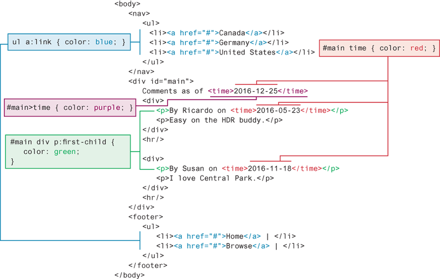
You can combine contextual selectors with grouped selectors. The comma is like the logical OR operator.
div#main div time, footer ul li { color: red; }

/* is equivalent to */

div#main div time { color: red; }
footer ul li { color: red; }
Book Page 138 4.5
Cascade and Inheritance
Inheritance is the first of these cascading principles. Many (but not all) CSS properties affect not only themselves but their descendants as well. Font, color, list, and text properties are inheritable; layout, sizing, border, background, and spacing properties are not.
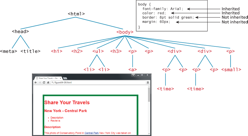
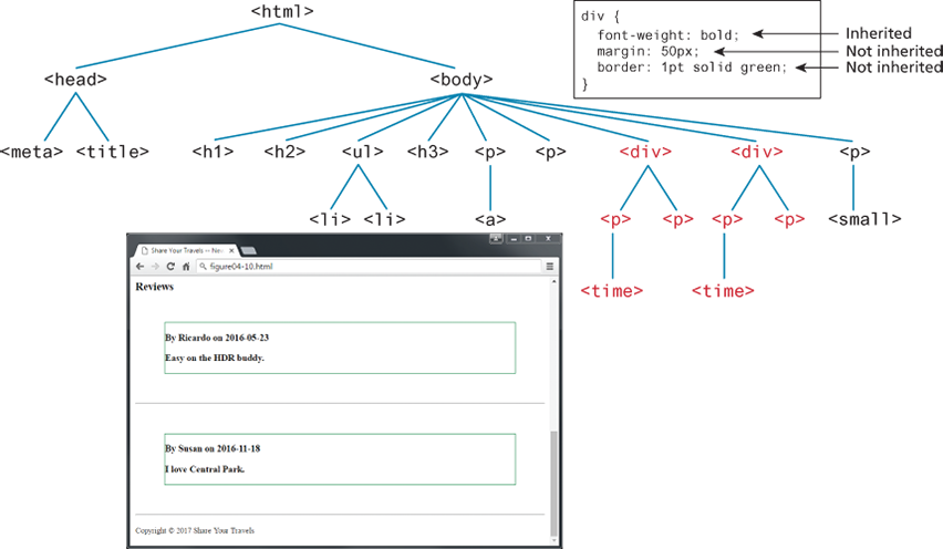
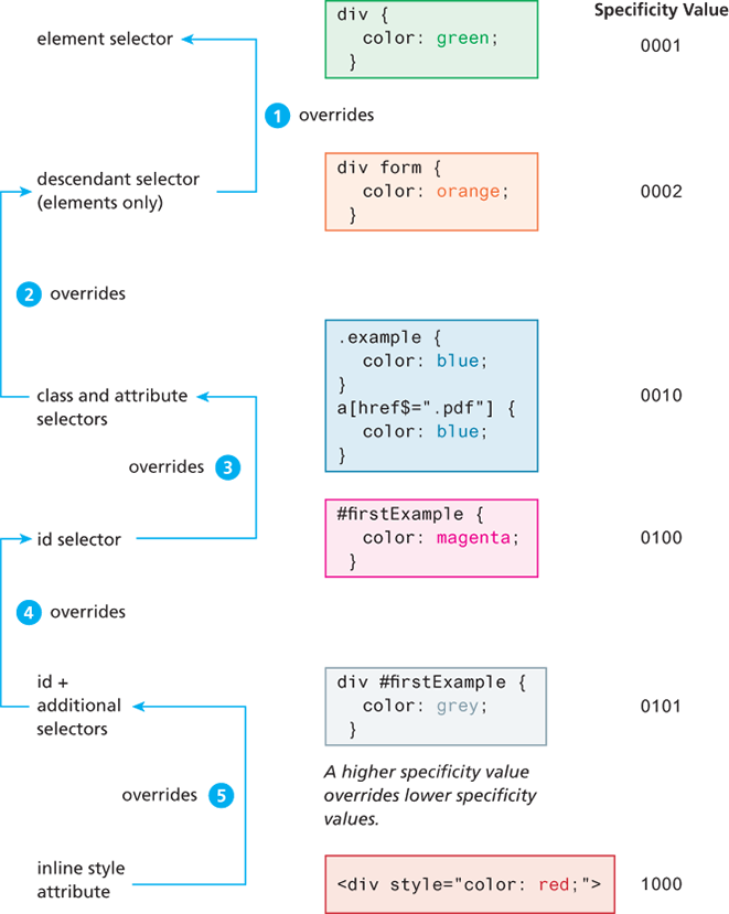
The browser assigns a weight to each style rule; when several rules apply, the one with the greatest weight takes precedence.
The color and font-weight properties defined in the <body> element are inheritable and thus potentially applicable to all the child elements contained within it. However, because the <div> and <p> elements also have the same properties set, they override the value defined for the <body> element because their selectors (<div> and <p>) are more specific. As a consequence, their font-weight is normal and their text is colored either green or magenta.
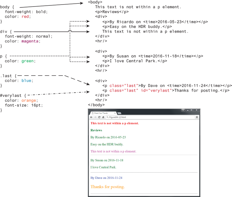
Class selectors take precedence over element selectors, and id selectors take precedence over class selectors. The precise algorithm the browser is supposed to use to determine specificity is quite complex.
! Important
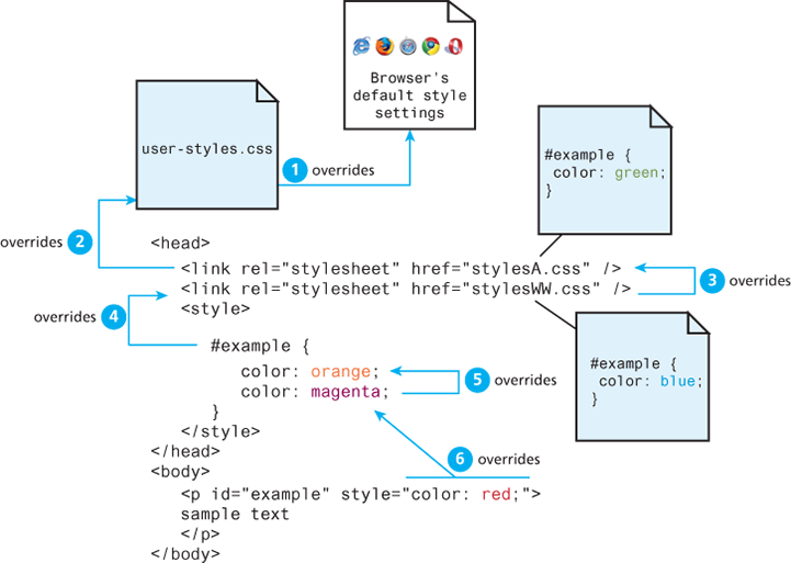
There is one exception to the principle of location. If a property is marked with !important (which does not mean NOT important, but instead means VERY important) in an author-created style rule, then it will override any other author-created style regardless of its location. The only exception is a style marked with !important in a user style sheet: such a rule will override all others. Of course very few users know how to do this, so it is a pretty uncommon scenario.
User style sheet
Creating a user stylesheet allows you to customize the appearance of websites in your own browser, without modifying their original code. This is especially useful for accessibility, reading comfort, or development purposes.
Browser extension
Stylus (Chrome, Firefox, Edge)
- Click on the Stylus icon in your browser.
- Click "Write style for this URL".
- Write your CSS, for example:
Stylus allows you to target all websites or just a specific one.
Enable user stylesheets manually
Firefox (the only browser that still supports this natively)
- Folder to open
- Windows: C:\\Users\\YourName\\AppData\\Roaming\\Mozilla\\Firefox\\Profiles\\xxxxxxx.default\\chrome\\
- macOS/Linux: ~/.mozilla/firefox/xxxxxxx.default/chrome/
- Create or edit a file named userContent.css
- Add your CSS inside, for example:
@-moz-document domain(example.com) {
  body {
    font-size: 24px !important;
    background: #fefefe !important;
  }
}
- In Firefox, open about:config and enable: t
oolkit.legacyUserProfileCustomizations.stylesheets→ set it to true
- Restart Firefox.
CSS Text Styling
| Property | Description |
|---|---|
font | A shorthand property that sets the font style, weight, variant, size, and family in one line. You must at least specify the font size and font family. The correct order is: style weight variant size font-family. |
font-family | Specifies the typeface or generic font family to use. You can specify multiple fonts as fallbacks (e.g., "Arial", sans-serif). |
font-size | Defines the size of the text using a unit like px, em, rem, %, etc. |
font-style | Specifies if the font should be italic, oblique (browser-simulated italic), or normal. |
font-variant | Specifies small-caps (small capital letters) or normal. |
font-weight | Defines the thickness of the text: normal, bold, bolder, lighter, or a numeric value from 100 to 900. Higher values = bolder text. |
font-family
Google font
Call a font added in your assets and use it :
@font-face { font-family: 'ubuntu_bold';src: url('../fonts/ubuntu_bold.ttf') format('truetype');}font-family: ubuntu_bold;
Call a font from Internet (suppose the browser is connected, doesn’t work without network) :
Check the url on Googe font
font-size
font-size: 25px;
Paragraph Properties
| Property | Description |
|---|---|
letter-spacing | Adjusts the space between letters. Can be normal or a length unit (e.g., px, em). |
line-height | Specifies the space between baselines (similar to "leading" in desktop publishing). Default is normal, but it can be set to any length unit or via the font shorthand. |
list-style-image | Specifies the URL of an image to use as the marker for unordered lists. |
list-style-type | Selects the marker type for ordered and unordered lists. Common values: disc, decimal, none (useful for menus or forms). |
text-align | Aligns text horizontally inside a container. Possible values: left, right, center, justify. |
text-decoration | Adds lines to text. Values: none, underline, overline, line-through, blink. Default for links is underline. |
text-direction | Specifies text direction: ltr (left-to-right) or rtl (right-to-left). |
text-indent | Indents the first line of a paragraph by a specified amount. |
text-shadow | Adds a drop shadow to text (CSS3). Accepts color, offset, and blur values. |
text-transform | Changes capitalization. Values: none, capitalize, lowercase, uppercase. |
vertical-align | Aligns text vertically inside its container. Common values: top, middle, bottom. |
word-spacing | Adjusts the space between words. Can be normal or a length unit. |
BOX
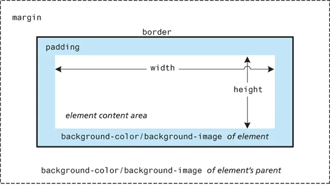
In CSS, all HTML elements exist within an element box. In order to become proficient with CSS, you must become familiar with the element box.
Background
| Property | Description |
|---|---|
background | A combined shorthand property that allows you to set multiple background values in one property. While you can omit properties with the shorthand, remember that any omitted properties will be set to their default value. |
background-attachment | Specifies whether the background image scrolls with the document (default) or remains fixed. Possible values are: fixed, scroll. |
background-color | Sets the background color of the element. You can use any of the techniques shown in Table 4.2 for specifying the color. |
background-image | Specifies the background image (usually a JPEG, GIF, or PNG) for the element. The URL is relative to the CSS file, not the HTML. CSS3 introduced support for multiple background images. |
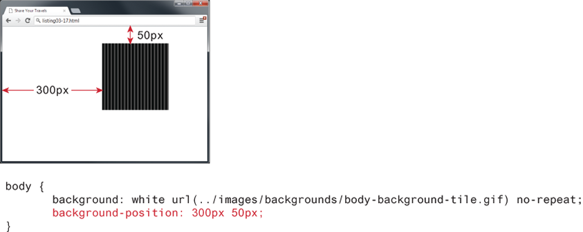
background-position | Specifies where the background image is placed. Possible values include: bottom, center, left, right, or numeric values (e.g., pixels or percentages) in horizontal/vertical pairs. Indicates distance from the top-left corner of the element. |
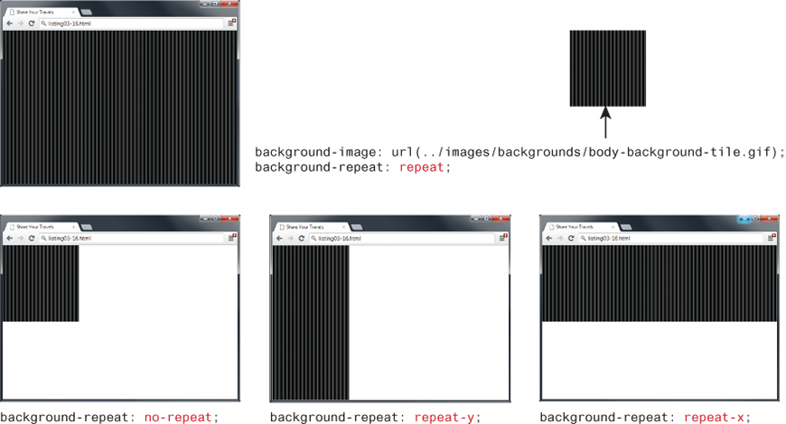
background-repeat | Determines whether the background image repeats. This is commonly used for tiling (the default behavior). Possible values: repeat, repeat-x, repeat-y, no-repeat. |
background-size | Introduced in CSS3, this property lets you modify the size of the background image. |
Border
| Property | Description |
|---|---|
border | A combined shorthand property that sets the style, width, and color of a border in one declaration. The order must be: border-style border-width border-color. |
border-style | Specifies the line type of the border. Possible values include: solid, dotted, dashed, double, groove, ridge, inset, and outset. |
border-width | Defines the width of the border in a unit (e.g., px, em). Percentage values are not allowed. Keywords such as thin, medium, and thick are also supported. |
border-color | Specifies the color of the border using any valid color unit (name, hex, rgb, etc.). |
border-radius | Defines the radius of rounded corners for the element. |
border-image | Specifies the URL of an image to use as a border. |
border-color: red;    /* sets all four sides to red */

border-top-color: red;             /* sets just the top side */
border-right-color: green;         /* sets just the right side */
border-bottom-color: yellow;       /* sets just the bottom side */
border-left-color: blue;           /* sets just the left side */

border-color: red yellow;    /* top+bottom=red, right+left=yellow */

border-color: red green orange blue;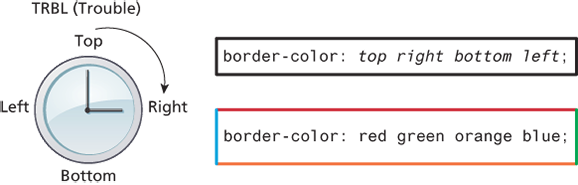
Margins and Padding
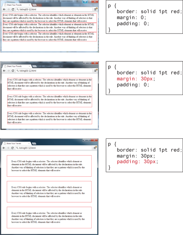
Margins and padding are essential properties for adding white space to a web page, which can help differentiate one element from another.
    margin-top: 10px;
    margin-right: 10px;
    margin-bottom: 10px;
    margin-left: 10px;

    margin: 10px;
    margin: 10px 10px;
margin: 10px 10px 10px 10px;| Syntax | Means |
|---|---|
margin: A; | top = right = bottom = left = A |
margin: A B; | top & bottom = A, right & left = B |
margin: A B C; | top = A, right & left = B, bottom = C |
margin: A B C D; | top = A, right = B, bottom = C, left = D |
Collapsing vertical margins
What this means is that when the vertical margins of two elements touch, only the largest margin value of the elements will be displayed, while the smaller margin value will be collapsed to zero. Horizontal margins, on the other hand, never collapse.
To complicate matters even further, there are a large number of special cases in which adjoining vertical margins do not collapse (see the W3C Specification for more detail).
margin: 90px 20px;

90px => margin-top & margin-bottom
20px => margin-left & margin-right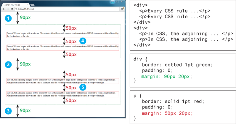
Box Dimensions
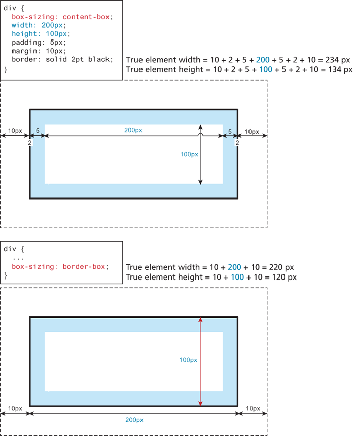
box-sizing define how are calculated the sizes/dimensions of an HATML element (width and height)
- with content-box the size of the content is the width
- with border-box the size of the content is the width minus the padding minus the border
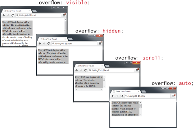
It is possible to control what happens with the content if the box's width and height are not large enough to display the content using the overflow property.
When the text takes more place than the box
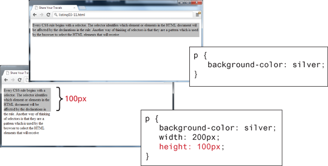
For block-level elements such as <p> and <div> elements, there are limits to what the width and height properties can actually do. You can shrink the width, but the content still needs to be displayed, so the browser may very well ignore the height that you set. The default width is the browser viewport.
But in the second screen capture in the image, with the changed width and height, there is not enough space for the browser to display all the content within the element. So while the browser will display a background color of 200×100 px (i.e., the size of the element as set by the width and height properties), the height of the actual textual content is much larger (depending on the font size)
Size in percentage
While the example CSS uses pixels for its measurement, many contemporary designers prefer to use percentages or em units for widths and heights. When you use percentages, the size is relative to the size of the parent element, while using ems makes the size of the box relative to the size of the text within it. The rationale behind using these relative measures is to make one's design scalable to the size of the browser or device that is viewing it.
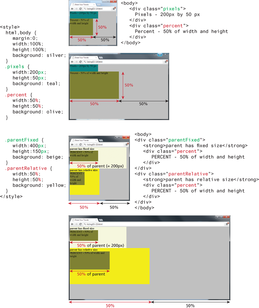
One of the problems with using percentages as the unit for sizes is that as the browser window shrinks too small or expands too large (for instance, on a wide-screen monitor), elements might become too small or too large. You can put absolute pixel constraints on the minimum and maximum sizes via the min-width, min-height, max-width, and max-height properties
Placement and responsive design
Media query is part of the responsive design
main {
    display: flex;

    @media (min-width: 600px) {
        flex-direction: row;
    }
    @media (max-width: 600px) {
        flex-direction: column;
    }

    border: 2px solid pink;
}


.aside_dev {


    @media (min-width: 600px) {
        width: 25%;
    }
    @media (max-width: 600px) {
        width: 90%;
    }
    min-width: 100px;
    height: 400px;
    overflow: hidden;

    margin-top: 10px;
    margin-right: 10px;
    margin-bottom: 20px;
    margin-left: 10px;

    padding-top: 10px;
    padding-right: 10px;
    padding-bottom: 10px;
    padding-left: 10px;

    border: 2px solid blue;


    background-image: url("../images/central-park.jpg");
    background-size: cover;

    font-family: "Roboto", sans-serif;
    font-weight: 400;
    color: white;
}
article {
    @media (min-width: 600px) {
        width: 75%;
    }
    @media (max-width: 600px) {
        width: 100%;
    }
}
SCSS
Created in 2009
- CSS (Cascading Style Sheets): The standard language for styling web pages.
- SCSS (Sassy CSS): A syntax of the Sass preprocessor that extends the capabilities of CSS.
Syntax
- CSS: Simple and strict syntax.
- SCSS: Fully compatible with CSS but allows advanced features (variables, functions, nesting, etc.).
/* CSS */
h1 {
  color: blue;
  font-size: 2rem;
}

// SCSS
$primary-color: blue;

h1 {
  color: $primary-color;
  font-size: 2rem;
}
Extra Features in SCSS
Variables
Nesting
Mixins (reusable blocks)
Functions
Math operations
Compilation
- CSS: Used directly by the browser.
- SCSS: Must be compiled into CSS using a tool like Sass.
Use Cases
- CSS: Simple use, suitable for small projects or beginners.
- SCSS: Recommended for complex projects, modular organization, and better maintainability.
Install SCSS with SASS
From the terminal in your project folder
cd /path/to/your-project

// This creates a package.json file with default values.
npm init -y

//Install Sass as a development dependency
npm install --save-dev sass

// In package.json
// Convert scss/main.scss to css/style.css
"scripts": {
  "sass:watch": "sass --watch scss/main.scss:css/style.css",
  "sass:build": "sass scss/main.scss:css/style.css"
}

npm run sass:watch


// Recommended Folder Structure

// your-project
├── /scss
│   └── style.scss
├── /css
│   └── style.css (automatically generated)
├── /public
│   └── index.php
├── package.json
└── node_modules/

// SCSS folder
/scss
├── style.scss              ← Fichier principal (point d’entrée)
├── _variables.scss        ← Couleurs, espacements, typographie, etc.
├── _mixins.scss           ← Fonctions réutilisables (médias, animations…)
├── _base.scss             ← Styles généraux (body, titres, reset)
├── _layout.scss           ← Grilles, sections, header/footer
├── _components.scss       ← Boutons, formulaires, cartes…
├── /components
│   ├── _button.scss
│   ├── _form.scss
│   └── _card.scss


// style.scss
@use 'variables';
@use 'mixins';
@use 'base';
@use 'layout';
@use 'components';
@use 'components/button';
@use 'components/form';
@use 'components/card';
Agence digitale Parisweb.art
Tout savoir sur Julie, notre directrice de projets digitaux :
https://www.linkedin.com/in/juliechaumard/